Forms
General guidelines for forms
Single column layout
Always use a single column layout for forms since this is better for readability and scanning through the form. Forms with multi-column designs often lead users to forget fields simply by not noticing them.

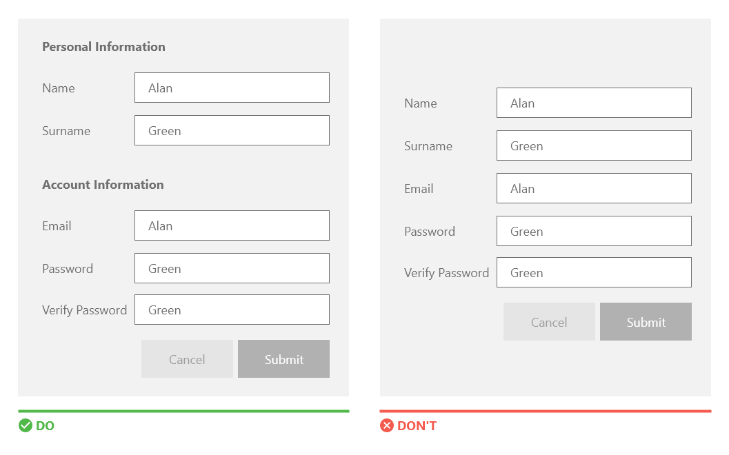
Group common or related elements
With grouping the form will look organised and clear. Group related information by adding sections with titles and/or separators.
Placeholders
Always use a label and not a placeholder to give important information about the input field. Placeholder text should only be used to provide additional hints and not to replace field labels. Without labels it will be difficult for the users to check their work before submitting.

Use autocomplete
With Autocomplete form completion is much faster. When possible always offer this possibility to the user. Elements like country, address, phone and email can all be autocompleted.
Required fields
Required fields are always marked with an asterisk *
Form input field labels
Input field labels are to be placed on the left hand side of the input field. In smaller screens the label should be on top of the input fields. Also avoid using all caps for input field labels and using very long label names.
Focus on field
The first input field in the form should always be in focus. When filling in the form a user should always see the active field in focus and this needs to be emphasized by means of a differenet colour border or background.

Clear action button
Always provide clear and obvious call to actions buttons. Make the CTAs descriptive so that the user immediately understands what to do.

CTA button styles
Make sure to differentiate the primary and secondary buttons clearly. Avoid using the same colour for primary and secondary buttons as this can mislead the user.

Provide input constraints
Reinforce the information required by users by means of visual constraints. Do not use simple inputs or dropdowns everywhere in forms. Use custom input format to enhance and also provide constraints. When adding input constraints, the user will be less prone to errors because the system is limiting what he/she needs to enter in the input field.

The following are some examples:
Telephone/Mobile numbersProvide the country prefix and a short input field with number constraints. Only allow numbers.

Provide the calendar icon and functionality.

Provide a list of nationalities.

Provide a list of countries or cities. Also predictive search may be used.

Use predictive search with auto-suggestions to easily find a specific address.

Use radio buttons or dropdown, so that the user can only select one option.

Reduce the size of the input field, since this will indicate that the field is not very long.

The use of multi-step or wizard is encouraged when there is a lot of information in one form and these can be split up into different categories. This type of setup will be more clear and manageable for the user.

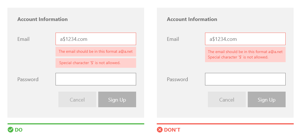
Always provide inline error messaging as this will be more clear for the user. These messages will be located next to or underneath the input field that has the error. The input field should also be highlighted generally with a red colour to indicate the error.

Error messages in forms should always provide informative text that will help the user rectify the error. The error should help the user and not be ambiguous.

In the case where multiple validation rules are broken, every single message should be represented in its own separate message box.
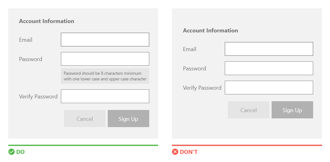
Tell the user what is required from them to fill in specific input fields. Do not wait until the form is completed to show them an error message. Do give them clear indication of specific rules.
When creating a form make sure to add the tab ordering correctly. When pressing tab the cursor should move from field to field in a sequence.
Other suggested guidelines- Avoid long names for CTA buttons,
- add appropriate instructions or help text next to the input field,
- for password input fields always inform users that the caps lock is on if it is,
- place checkboxes and radio buttons underneath each other - more clear,
- users should be able to review, confirm and rectify information before finalising submission of the form.